Top 20 Free Fonts for UI Designers 2025
We're back with our Top 20 Free Fonts for 2025 for designers, all with the links to download in one handy spot! Browse below to grab the free download links.
Discover a curated list of beautiful fonts, guaranteed to suit your next project.
With the endless amount of free fonts available, choosing the right one for your website can be a daunting task. Not all fonts are created equal and choosing a free, yet high quality font can be overwhelming.
We've simplified this for you and have collated our Top 20 Free Fonts for 2025. We've handpicked the best fonts so you can create products that are beautiful, professional and visually interesting, but most importantly, perform well.
You loved our last curated list, so we're back again with the goods for 2025 - enjoy!
For the full details and a preview, keep scrolling - but here they are, in no particular order!
- Bricolage Grotesque (Download)
- Overused Grotesk Roman (Download)
- Funnel Display (Download)
- Clash Display (Download)
- Geist Mono (Download)
- Gabarito (Download)
- Rubik (Download)
- Onest (Download)
- Sora (Download)
- Literata (Download)
- Parkinsans (Download)
- Geist (Download)
- Montagu Slab (Download)
- Inter Display (Download)
- Be Vietnam Pro (Download)
- BDO Grotesk (Download)
- Hedvig Letters Serif (Download)
- Boska (Download)
- Instrument Serif (Download)
- Mona Sans (Download)
Whether you're designing your portfolio, a business site or your next brand, these fonts will perform for you across all touchpoints. So, let's dive in and discover the perfect free fonts for your next project.
Top 20 Free Fonts
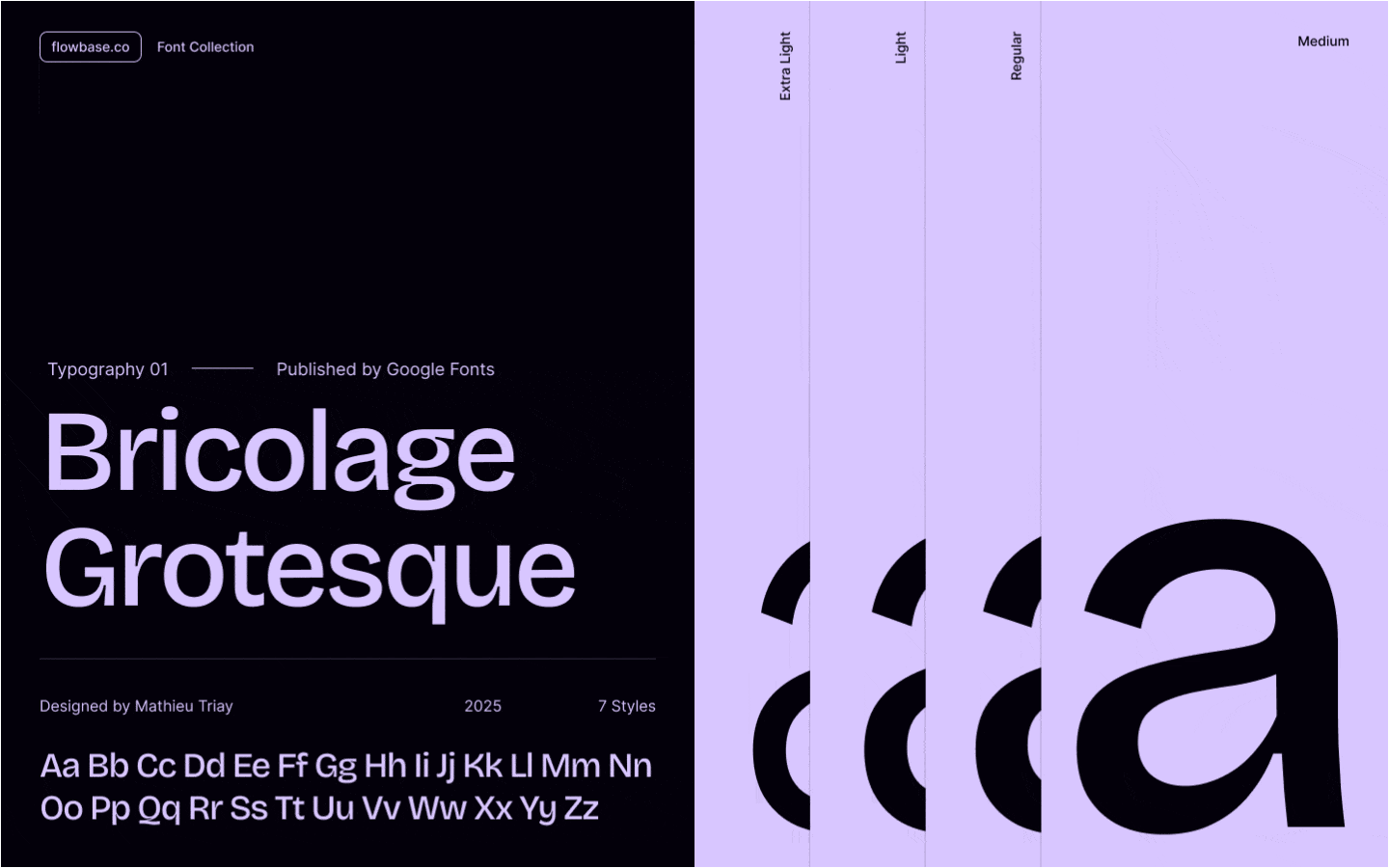
Bricolage Grotesque
Designed by Mathieu Triay, Bricolage Grotesque blends historical influences from French and British typefaces. It offers versatility across weight, width, and optical size axes, making it suitable for a range of design projects.
You can download Bricolage Grotesque here.

Overused Grotesk Roman
Created by Random Maerks, Overused Grotesk is a variable sans-serif typeface inspired by classic Swiss designs. It features multiple weights and styles, providing flexibility for various design applications.
You can download Overused Grotesk Roman here.

Funnel Display
Funnel Display is a sharp and geometric typeface designed for high-impact visual experiences. It works exceptionally well in headlines and poster designs where bold typography can shine. This font was developed through a collaboration between the brand agency NORD ID and type designer Kristian Möller.
You can download Funnel Display here.

Clash Display
Clash Display is a bold serif typeface, designed to make a statement in modern design. With high-contrast letterforms and elegant curves, it offers multiple weights and styles, providing flexibility for your designs. Clash Display was designed by Indian Type Foundry.
You can download Clash Display here.

Geist Mono
A clean, monospaced typeface with a contemporary aesthetic. Geist Mono is perfect for tech-related projects, coding interfaces, or any design requiring a modern yet functional typeface. It was developed by Vercel in collaboration with Basement Studio.
You can download Geist Mono here.

Gabarito
Inspired by architectural blueprints and technical design, Gabarito has a structured and modular appearance. It's great for minimalist design projects that call for precision and clarity. Gabarito was designed by Naipe Foundry, Leandro Assis, Álvaro Franca & Felipe Casaprima
You can download Gabarito here.

Rubik
Designed by Philipp Hubert and Sebastian Fischer, Rubik is a versatile sans-serif font with slightly rounded corners that make it approachable and modern. It is highly readable, making it a popular choice for web design.
You can download Rubik here.

Onest
A balanced and elegant sans-serif typeface, Onest is both modern and timeless. It excels in both headline treatments and long-form text, offering great flexibility for a wide range of uses. Onest was designed by Dmitri Voloshin & Andrey Kudryavtsev.
You can download Onest here.

Sora
Sora is a futuristic and geometric sans-serif font. Its sharp angles and clean lines make it a perfect choice for modern branding. Sora was designed by Jonathan Barnbrook & Julian Moncada.
You can download Sora here.

Literata
Designed by Type Together, Literata is a sophisticated and elegant serif font designed for reading. It offers excellent legibility and a refined aesthetic, making it perfect for long-form content.
You can download Literata here.

Parkinsans
Designed by Red Stone, Parkinsans is a clean and utilitarian sans-serif typeface, ideal for user interfaces, websites, and other digital experiences requiring clarity and readability.
You can download Parkinsans here.

Geist
Designed by Vercel, Geist is a contemporary sans-serif font with clean lines and a minimalist aesthetic. It works beautifully in projects requiring a modern visual design.
You can download Geist here.

Montagu Slab
Montagu Slab is a refined slab-serif typeface known for its sturdy serifs and balanced letterforms, blending traditional and modern elements. Its versatility and elegant design make it ideal for editorial, branding, and digital applications. Montagu Slab was designed by Florian Karsten.
You can download Montagu Slab here.

Inter Display
Created by Rasmus Andersson, Inter Display is a refined sans-serif typeface designed for impactful display text. With multiple weights and optimized letterforms, it offers excellent legibility, making it ideal for headlines, branding, and applications.
You can download Inter Display here.

Be Vietnam Pro
Designed by Lâm Bảo, Tony Le & ViệtAnh Nguyễn, Be Vietnam Pro is inspired by contemporary global aesthetics. With its multiple weights and styles, it offers flexibility and seamlessly balances functionality and personality.
You can download Be Vietnam Pro here.

BDO Grotesk
BDO Grotesk is a distinctive font with bold geometric shapes and versatile weights. Its clean, modern letterforms make it suitable for a range of purposes. BDO Grotesk was designed by Deni Anggara & Fadhl Haqq.
You can download BDO Grotesk here.

Hedvig Letters Serif
Designed by Kanon Foundry, Alexander Örn, Tor Weibull & Hedvig, Hedvig Letters Serif is a sophisticated font with elegant curves and refined proportions.
You can download Hedvig Letters Serif here.

Boska
Another font from Indian Type Foundry, Boska is sleek and modern, designed to deliver strong visual impact. With its range of weights and clean letterforms, it is ideal for branding and advertising.
You can download Boska here.

Instrument Serif
Designed by Rodrigo Fuenzalida & Jordan Egstad, Instrument Serif is a modern serif typeface combining traditional influences with contemporary flair. Its high contrast and elegant letterforms provide flexibility for multi-purpose use.
You can download Instrument Serif here.

Mona Sans
Designed by GitHub & Degarism Studio, Mona Sans is a clean and versatile sans-serif typeface with a minimalist aesthetic.
You can download Mona Sans here.

Tips for Choosing the Right Font
With a tonne of free fonts available online, there's no need to spend a fortune on typography. Experimenting with different free typefaces can transform your designs and ensure your content is accessible for all readers.
Remember to test the legibility of your font across various devices and screen sizes. As detailed in Web Interface Guideline, fonts should have -webkit-font-smoothing: antialiased and text-rendering: optimizeLegibility applied for better legibility.
Additionally, font weights below 400 should not be used and medium sized headings look best with a weights between 500-600.
Don't forget to also check your chosen font's license terms when considering your usage.
We hope this list has saved you time in picking a font that is beautiful and functional for your next project!
Looking for more free fonts?
Don't forget to check out our last curated list here.
Did you find this helpful? 💕
Your support means the world to us! In just 10 seconds, you can make a big difference:
- Join our community Discord Channel.
- Download our Free Webflow Booster App.
- Share what you built with us on Twitter! We re-post to thousands!
Thank you for being awesome! 🌟


Discover unlimited inspiration to help you build better, faster.


Join our community and
claim free products
No Spam. Only sweet content and updates of our products.
Join 100k+ other creators in our community


